
 Quality Management



















 IT Service Management



 Project Management



 Agile Management




 Web Development



 Cloud Computing


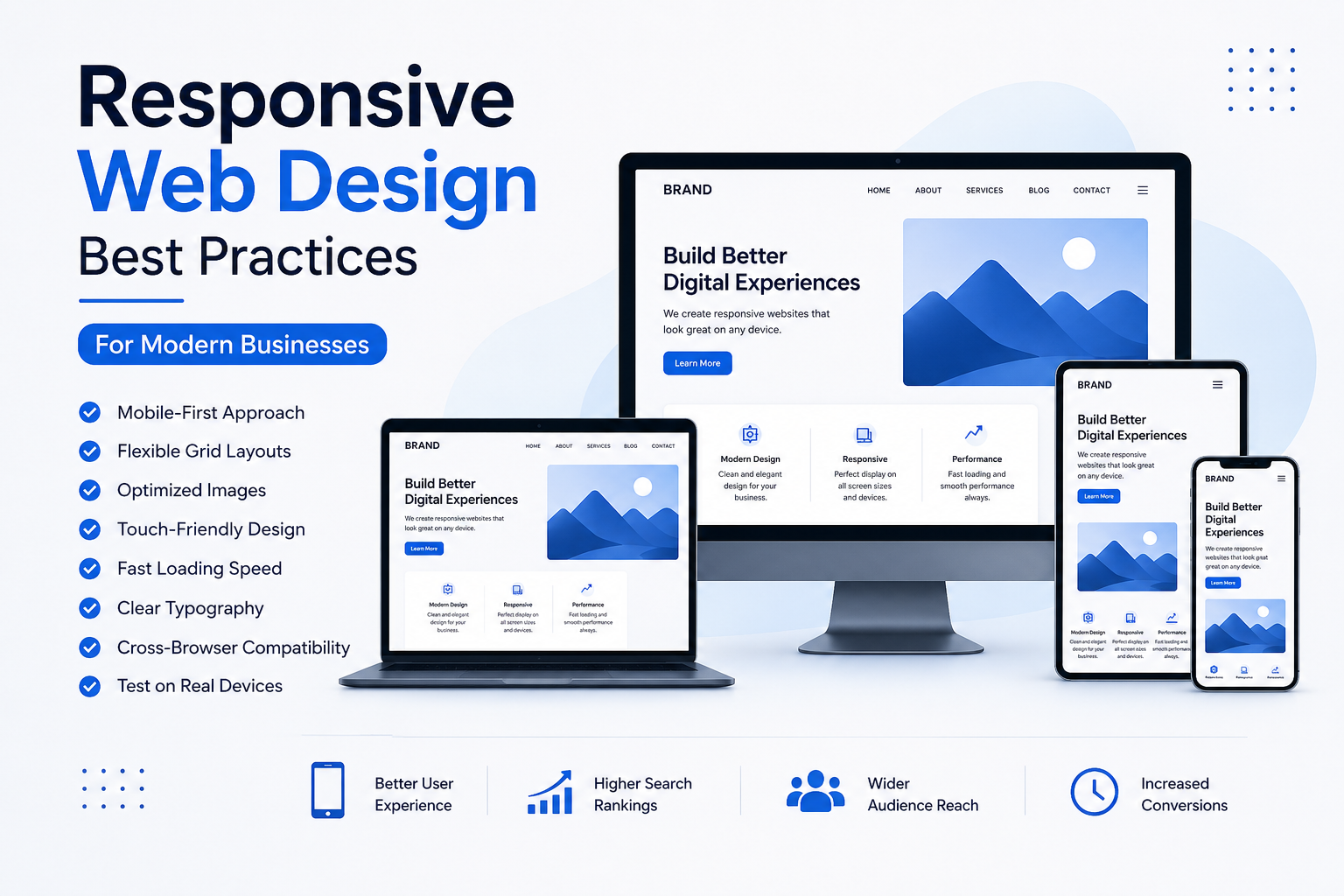
In today’s digital landscape, where mobile devices dominate web traffic, having a responsive web design is no longer optional—it’s essential. A mobile friendly website is key to providing a seamless user experience across various devices, enhancing engagement, and boosting conversions. In this blog, we will dive into the best practices for responsive website development that cater specifically to the needs of modern businesses in India.
Why Responsive Web Design Matters
Responsive web design is an approach that allows web pages to render well on a variety of devices and window or screen sizes. This adaptability is crucial, especially given that over 60% of internet users in India access the web via mobile devices. Here are a few reasons why responsive web design is critical for modern businesses:
- Improved User Experience (UX Design): A mobile friendly website enhances UX by providing easy navigation, readable text without excessive zooming, and optimized images for faster loading times.
- Better SEO Rankings: Search engines, particularly Google, favor mobile-friendly websites, which can improve your visibility and rankings in search results.
- Cost-Effective: Instead of creating separate websites for desktop and mobile users, responsive design allows you to maintain a single site that serves all devices.
- Higher Conversion Rates: A seamless experience leads to higher customer satisfaction, which in turn boosts conversion rates.
Best Practices for Responsive Web Design
1. Mobile-First Approach
Adopting a mobile-first approach means designing your website for smaller screens before scaling it up for larger displays. This practice helps prioritize essential content and features, ensuring that your mobile friendly website is effective and user-centric.
2. Fluid Grid Layouts
Utilize fluid grid layouts that use percentages instead of fixed pixel sizes for layout elements. This allows your website to adapt to the screen size smoothly. By doing so, you can ensure that your content scales appropriately, regardless of the device being used.
3. Flexible Images
Images should also respond to the screen size. Use CSS to set the maximum width of images to 100%, ensuring they resize within their containing elements. This prevents images from spilling over on smaller screens, maintaining the integrity of your responsive website development.
4. Viewport Meta Tag
Incorporate the viewport meta tag in your HTML to control the layout on mobile browsers. This tag ensures that your website is displayed correctly on devices of all sizes. The typical tag looks like this:
5. Prioritize Content
Not all content is created equal. Identify which elements are crucial for your users and prioritize their visibility. Use progressive enhancement to ensure core content is accessible on smaller screens without overwhelming users with unnecessary information.
6. Responsive Typography
Typography is an essential component of UX design. Make sure your text is legible on all devices by using responsive font sizes. CSS units like "em" or "rem" can help achieve this by allowing text to scale according to the user’s default settings.
7. Touchscreen Readiness
Ensure that buttons and links are easy to tap on touchscreen devices. A good rule of thumb is to make buttons at least 44 pixels tall, providing ample space for users to navigate without error.
8. Testing Across Devices
Regular testing is vital to ensure that your mobile friendly website functions properly on various devices and browsers. Use tools like Google’s Mobile-Friendly Test and BrowserStack to check compatibility and performance.
9. Optimize for Speed
Page load speed is crucial for user retention. Optimize images, leverage browser caching, and minimize HTTP requests to enhance the loading times of your website. Google PageSpeed Insights can provide actionable recommendations to improve your site’s performance.
10. Use Media Queries
CSS media queries allow you to apply different styles based on the device characteristics, such as width, height, or resolution. This enables you to create tailored experiences for desktop, tablet, and mobile users.
Enhancing UX Design with Responsive Web Design
Incorporating best practices in responsive web design greatly enhances UX design. A well-structured, user-friendly website encourages visitors to explore and interact with your content, ultimately leading to higher engagement and conversions. Here’s how to enhance your UX design:
- Simplified Navigation: Opt for a simplified menu structure that’s easy to navigate on mobile devices.
- Clear Calls to Action: Ensure that CTAs are prominent and easy to click, guiding users towards desired actions.
- Consistent Branding: Maintain a consistent brand identity across all devices, reinforcing brand recognition and trust.
Common FAQs about Responsive Web Design
1. What is responsive web design?
Responsive web design is an approach to web development that creates websites that automatically adapt to different screen sizes and devices, ensuring a seamless user experience.
2. Why is a mobile friendly website important?
A mobile friendly website is important because it enhances user experience, improves SEO rankings, and increases conversion rates by providing users with easy access to your content regardless of the device they are using.
3. How can I check if my website is responsive?
You can check if your website is responsive by using Google’s Mobile-Friendly Test tool or by manually resizing your browser window to see how your website adapts to different screen sizes.
4. What are media queries in CSS?
Media queries are a CSS technique that allows you to apply different styles to a webpage based on the device’s characteristics, such as screen width, making it an essential tool in responsive web design.
Conclusion
Implementing responsive web design best practices is crucial for modern businesses looking to thrive in a competitive digital environment. By creating a mobile friendly website that prioritizes user experience, you can increase engagement, improve SEO, and drive conversions. Don’t leave your website’s performance to chance—invest in responsive website development today.
Are you ready to optimize your website for a better user experience? Contact us today to get started on your journey to an effective, responsive web design that meets the needs of your audience!





Leave a Comment