
 Quality Management



















 IT Service Management



 Project Management



 Agile Management




 Web Development



 Cloud Computing


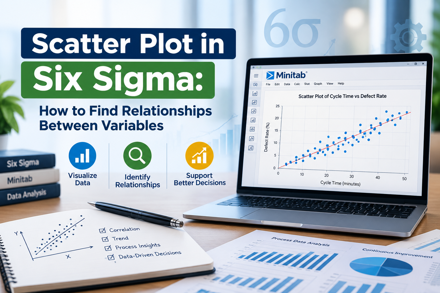
In the world of data analysis and quality improvement, Six Sigma has emerged as a powerful methodology. One of the essential tools used in Six Sigma is the scatter plot. This graphical representation allows teams to visualize the potential relationships between two variables, ultimately aiding in decision-making processes. In this blog, we will delve deep into the significance of the scatter plot in Six Sigma and how you can effectively utilize it to uncover relationships between variables.
What is a Scatter Plot?
A scatter plot is a type of data visualization that uses Cartesian coordinates to display values for two variables. Each point on the plot represents an observation with its position determined by the values of the two variables being analyzed. When applied in the context of Six Sigma, a scatter plot helps identify correlations, trends, and patterns that can shed light on process improvements.
Importance of Scatter Plots in Six Sigma
Using scatter plots in Six Sigma provides several advantages:
- Identifying Relationships: Scatter plots can reveal whether a relationship exists between two variables. For instance, you might want to analyze if there's a correlation between the amount of training employees receive and the quality of their output.
- Visualizing Data: A scatter plot offers a clear visual representation of data, making it easier to interpret complex information quickly.
- Detecting Outliers: Scatter plots can help identify unusual data points that may indicate errors or unique cases worth further investigation.
- Facilitating Communication: Visual data representations like scatter plots make it easier to communicate findings to stakeholders and team members who may not be familiar with data analysis.
How to Create a Scatter Plot in Six Sigma
Creating a scatter plot is a straightforward process. Here’s a step-by-step guide tailored for Six Sigma practitioners:
Step 1: Collect Data
Start by gathering the data relevant to the two variables you want to analyze. Ensure that the data is accurate and representative of the process you are studying. For example, if you are analyzing customer satisfaction scores against the time taken to resolve customer complaints, collect data points for both variables over a specific period.
Step 2: Prepare Data for Plotting
Once you have your data, organize it in a table format. Each row should represent an observation, with one column for each variable. This organization will make it easier to plot the data later on.
Step 3: Plot the Data
Using software tools like Microsoft Excel, Google Sheets, or specialized statistical software, create a scatter plot. Input the values of one variable along the x-axis and the other along the y-axis. Each data point will then be plotted on the graph based on its corresponding values.
Step 4: Analyze the Scatter Plot
Once your scatter plot is ready, examine it for trends and patterns. Look for the following:
- Positive Correlation: If the points trend upwards from left to right, it indicates a positive relationship between the variables.
- Negative Correlation: A downward trend suggests a negative relationship.
- No Correlation: If the points are scattered randomly, there may be little to no relationship between the variables.
- Outliers: Identify any points that deviate significantly from the overall pattern.
Interpreting Results: Correlation Coefficients
While scatter plots provide a visual representation, quantifying the strength of the relationship is also crucial. This is where correlation coefficients come into play. The Pearson correlation coefficient (r) ranges from -1 to 1:
- r = 1: Perfect positive correlation
- r = -1: Perfect negative correlation
- r = 0: No correlation
A strong correlation (close to 1 or -1) indicates a significant relationship between the variables, while a weak correlation (close to 0) suggests minimal or no relationship. Understanding this metric can greatly enhance your Six Sigma projects by guiding where improvements can be made.
Common Applications of Scatter Plots in Six Sigma
Scatter plots have diverse applications in various industries. Here are a few common uses within Six Sigma:
1. Quality Control
In manufacturing, scatter plots can help identify relationships between production variables (e.g., machine speed vs. defect rates) to optimize processes and improve product quality.
2. Customer Satisfaction Analysis
Businesses can analyze the correlation between service response time and customer satisfaction scores to enhance their service delivery.
3. Employee Performance Evaluation
HR departments can utilize scatter plots to explore the relationship between training hours and employee performance metrics, ensuring better training strategies are implemented.
FAQs About Scatter Plots in Six Sigma
What is the primary purpose of using a scatter plot in Six Sigma?
The primary purpose is to visualize and identify relationships between two variables, helping teams pinpoint where improvements can be made in processes.
Can scatter plots be used for more than two variables?
While traditional scatter plots illustrate relationships between two variables, you can use multiple scatter plots or 3D scatter plots for more complex analyses.
How can I ensure the accuracy of my scatter plot data?
Ensure that the data you collect is accurate, consistent, and representative of the process you are analyzing. Data validation processes can help improve accuracy.
What tools can I use to create scatter plots?
Common tools include Microsoft Excel, Google Sheets, R programming language, and specialized statistical software like Minitab.
Conclusion
In summary, the scatter plot is an invaluable tool in the Six Sigma toolkit, enabling practitioners to identify and analyze relationships between variables effectively. By employing scatter plots, teams can make data-driven decisions that lead to significant process improvements and enhanced quality outcomes.
As you explore the fascinating world of data analysis in Six Sigma, don’t forget to incorporate scatter plots into your toolkit. They can provide the insights you need to optimize your processes and drive success.
Call to Action
If you’re ready to enhance your Six Sigma skills and make data-driven decisions, consider enrolling in a Six Sigma training program today! Learn how to leverage powerful tools like scatter plots and take your career to the next level.



Leave a Comment